Alexandre Family Ecodairy Farms
Identity // Logo Update / Refinement
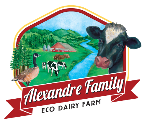
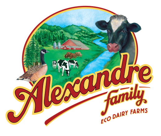
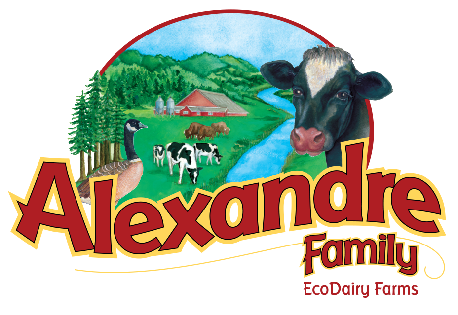
Initially we planned for a more thorough logo revamp, but realized the family was partial to their existing logo. Retaining the main watercolor artwork was a must, so we focused our efforts on containing the imagery and improving the typography. The project was a good lesson in listening to the client’s needs instead of forcing our own agenda.
PREVIOUS LOGO
The previous logo is displayed first. Following is the updated version along with the design iteration process.
The previous logo is displayed first. Following is the updated version along with the design iteration process.


Website // Before and After
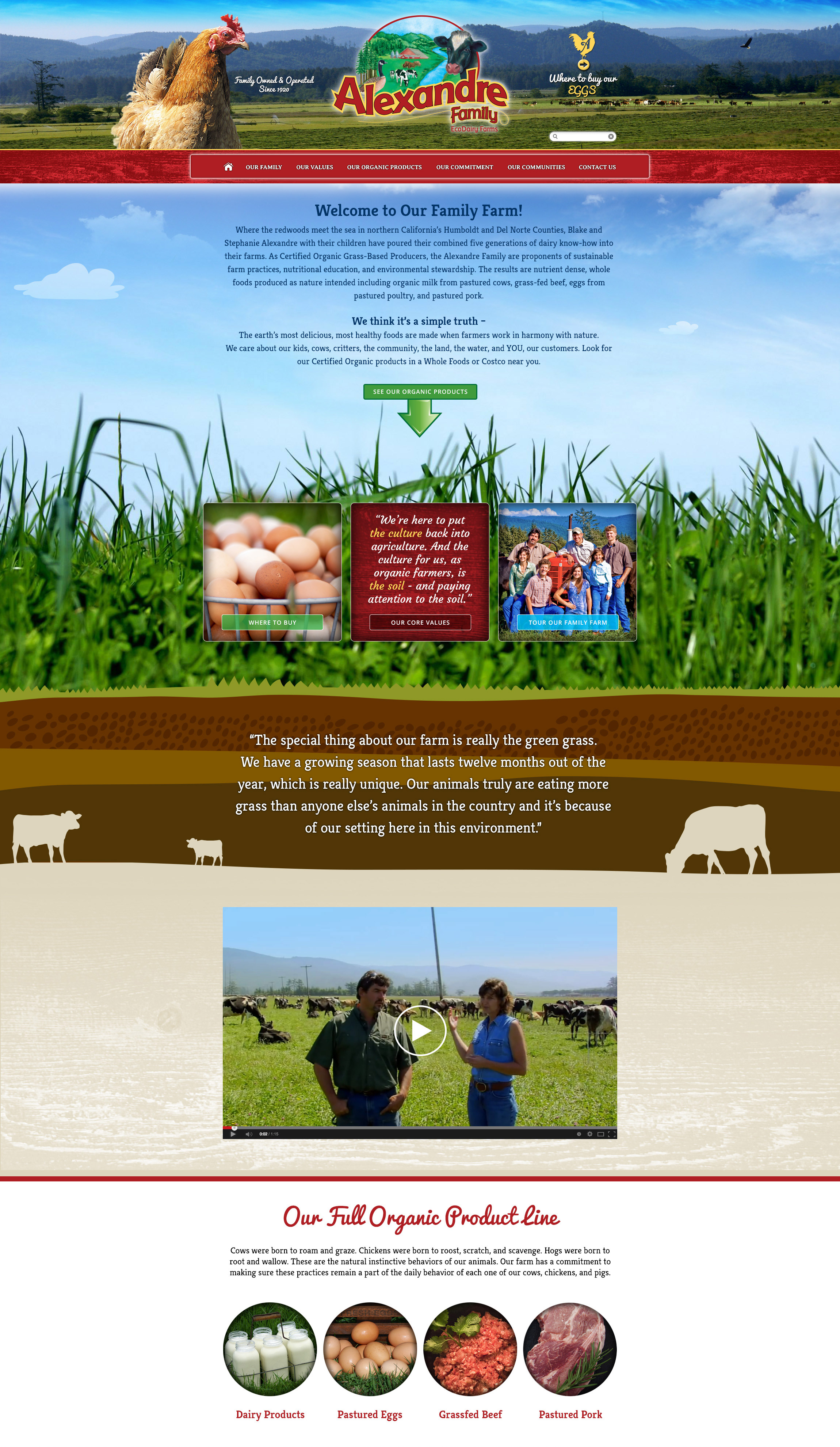
PREVIOUS SITE
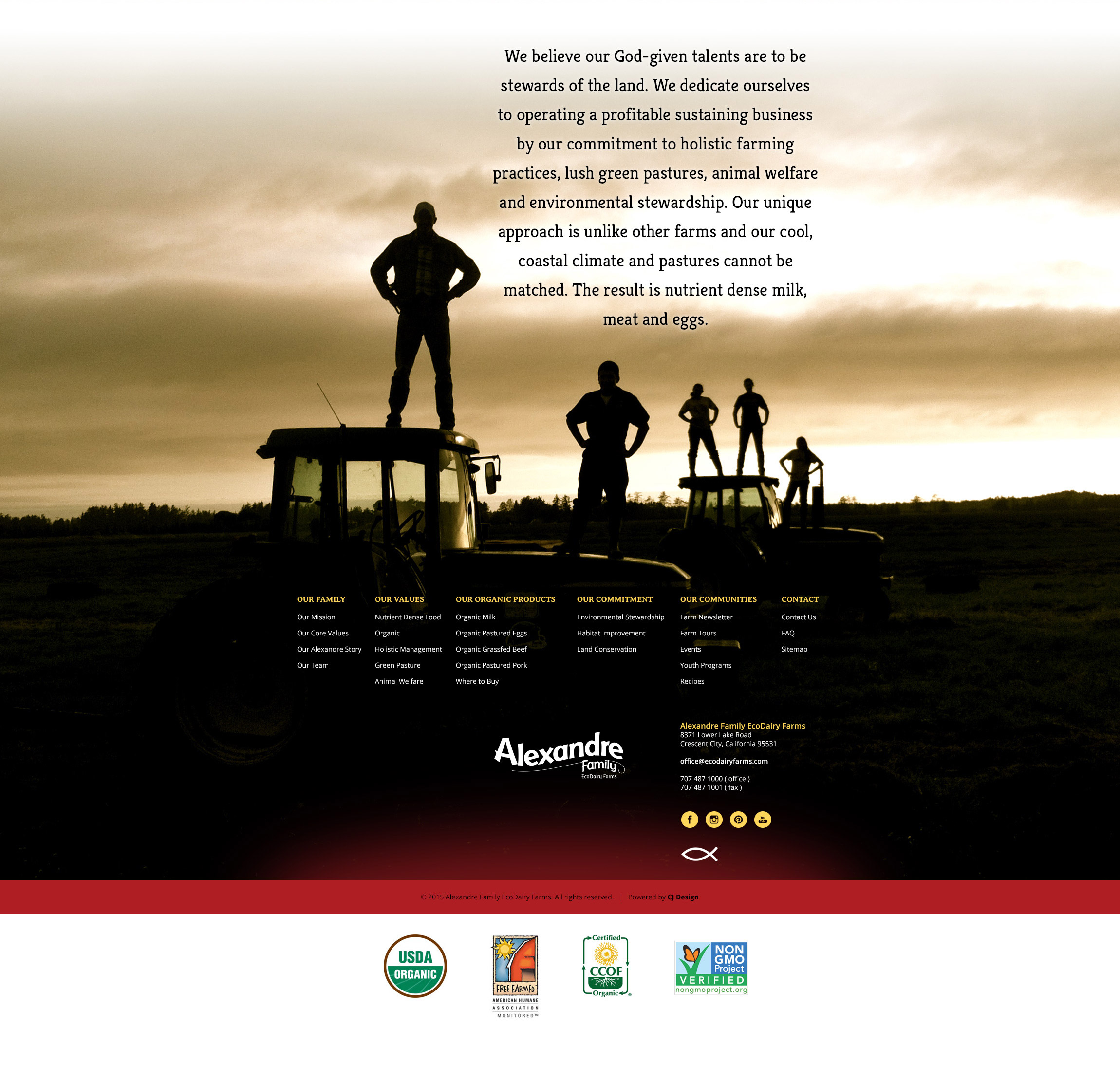
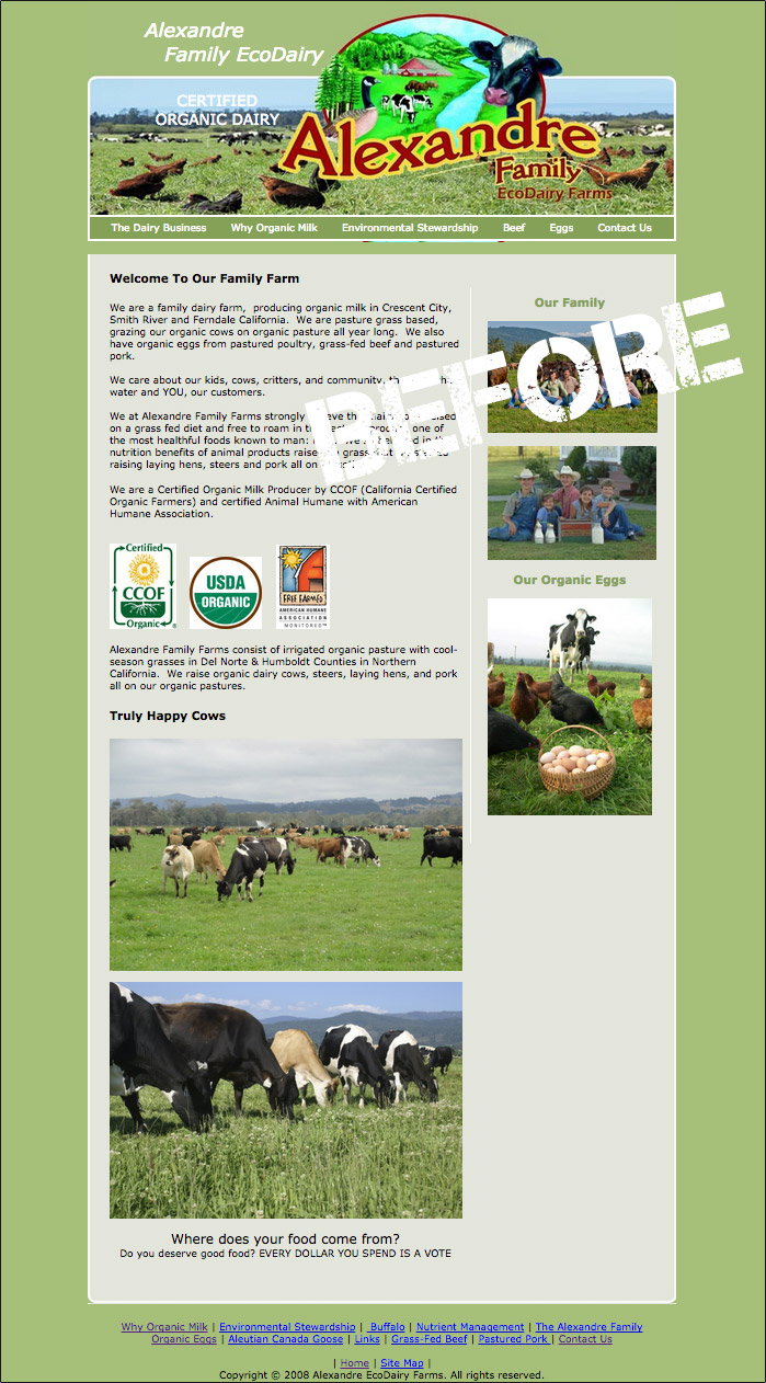
Pictured first is the company’s previous site, built prior to the adoption of mobile. It shows its age with regard to layout and design and lacks the visual punch necessary to set the organic farm apart from others on the shelves of stores like Whole Foods and Costco.
Pictured first is the company’s previous site, built prior to the adoption of mobile. It shows its age with regard to layout and design and lacks the visual punch necessary to set the organic farm apart from others on the shelves of stores like Whole Foods and Costco.
CONTACT US
Don't hesitate to reach out with your branding or advertising needs. Yes, we work with some large, well-known companies, but we also help small local businesses as well. Send an email or give a call and we can start to plan for next steps toward design strategy.
© Graphic Regime // Santa Cruz, CA

